Some creatives have a way of turning the ordinary into something cinematic. That’s Lexie Heubner.
With a vintage camcorder heart and a filmmaker’s eye, she captures the feeling of the Midwest with such soul — like you’re watching a memory unfold in real time. And when she came to me, she was ready for a brand that could hold all of that.

The Beginning
Lexie is based in Illinois — a Midwest girl through and through. The daughter of a farmer, she’s rooted in slow living, family, and a deep appreciation for beauty that doesn’t need to try too hard.
Her films are honest and full of feeling: wind‑swept cornfields, laughter between high‑school sweethearts turned newlyweds, golden sunlight weddings at golden hour. It’s luxury, yes — but grounded. Storytelling that feels equal parts editorial and human.
When we first started working together, Lexie wanted to grow. She dreamed of documenting love stories in new places, like Lake Como, but also wanted her brand to honor where she came from. The warmth. The roots. The relationships that make her work so special.
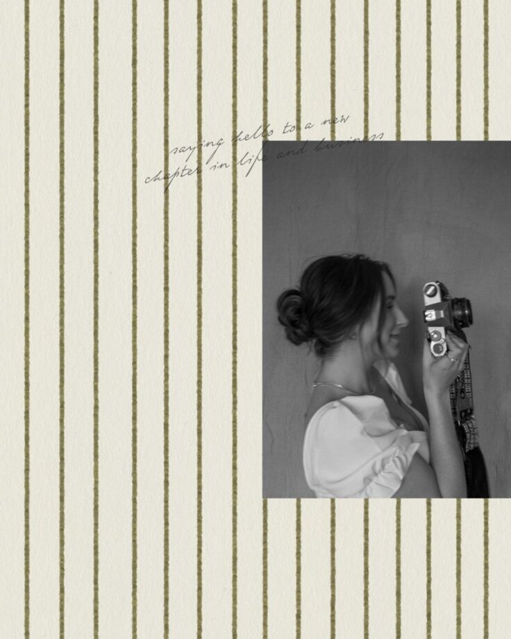
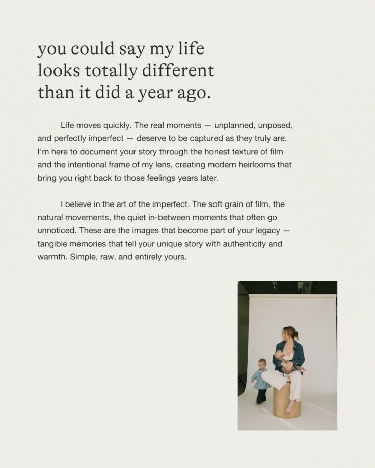
She’d just had her second baby, was balancing motherhood and business, and was ready to step fully into the next chapter of her creative career.
The Elevation
From the beginning, we knew we wanted to build something intentionally imperfect. Elevated but analog. A brand that felt like it could live inside a weathered journal, with film prints tucked between its pages.
We leaned into an elevated scrapbook aesthetic (torn edges, tactile layers, and nostalgic textures) and balanced it with an editorial touch. The goal was to create a brand that honored her love of handmade – without losing its sophistication.
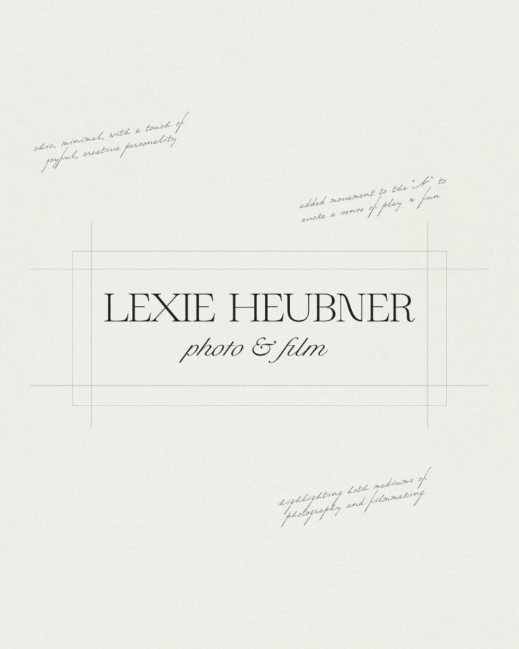
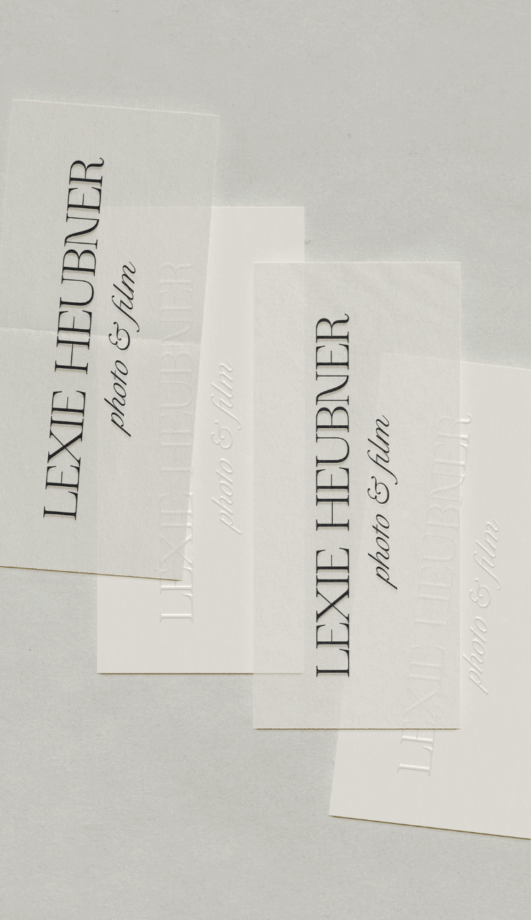
The Visual Direction
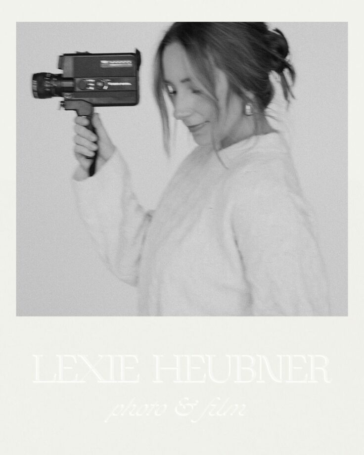
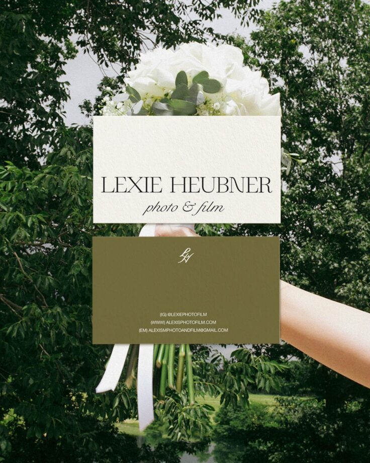
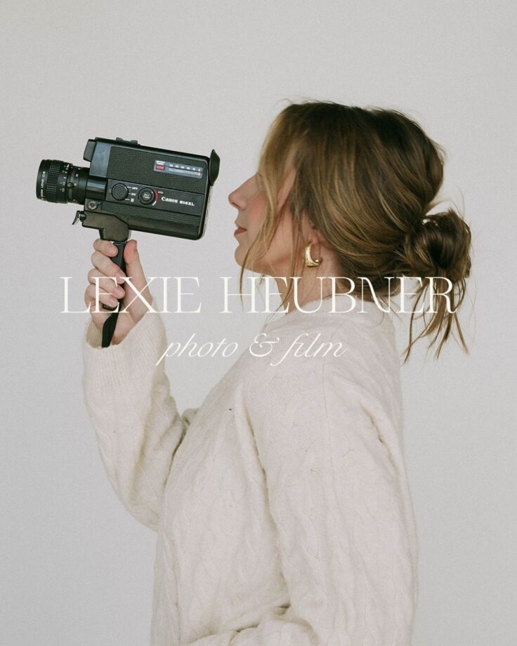
Because her name is her brand, we wanted it to stand confidently on its own. So, we kept her wordmark simple, classic, and quietly bespoke — just enough playfulness to feel like her, while maintaining the kind of timelessness that will age gracefully alongside her business.
The color palette leans into neutrals inspired by the Midwest landscape — soft wheat, vintage cream, warm taupe, and gentle film grain grays. And for her mark, we introduced a hand‑drawn monogram. Rather than leaning into overtly feminine iconography, we kept it classic — a subtle nod to craftsmanship, tradition, and the beauty of restraint. It felt personal, distinct, and strong enough to live anywhere.
Her typography was my favorite detail: understated serifs with italic movement, just a touch of whimsy, balanced by clean sans text. It’s a documentary and romance all at once.

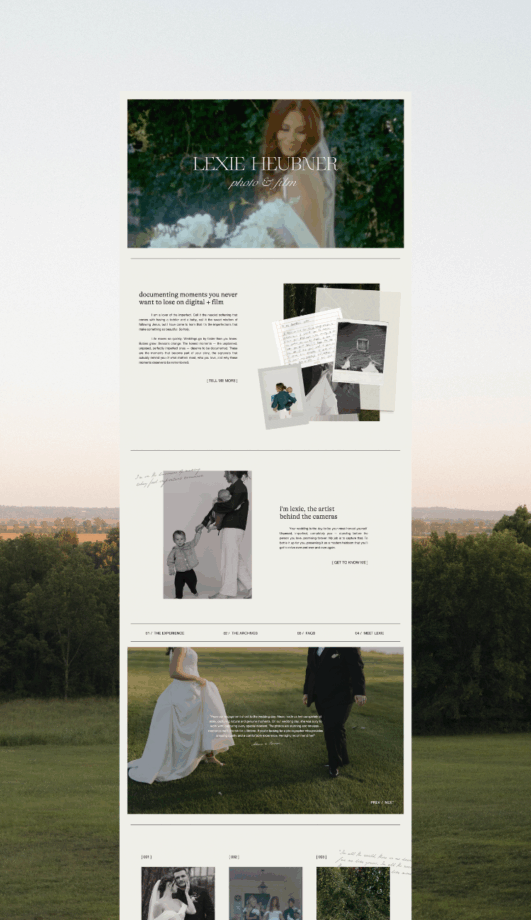
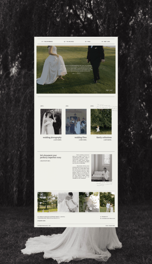
The Website
Lexie’s imagery was breathtaking from the start — so we let it take center stage. The site itself is minimal, artful, and immersive, which serves as a quiet frame for her stories.
Each page feels like it was torn from a keepsake album: layered paper textures, handcrafted edges, handwritten elements – all subtle enough to enhance her work rather than compete with it.
This project was a reminder that sometimes the quietest choices (the soft serif, the simple mark, the blank space that lets the work breathe) speak the loudest.
Lexie, it was an honor to help you shape this next chapter — and to build a brand that feels as honest, artful, and layered as your work.


While I don’t take on custom projects anymore, I’ve poured everything I’ve learned into resources and templates for creatives just like you. If you’re dreaming of a brand that feels like home, the Studio Gail Shop is a beautiful place to begin.
Client Files: Lexie Heubner
Filed:


")