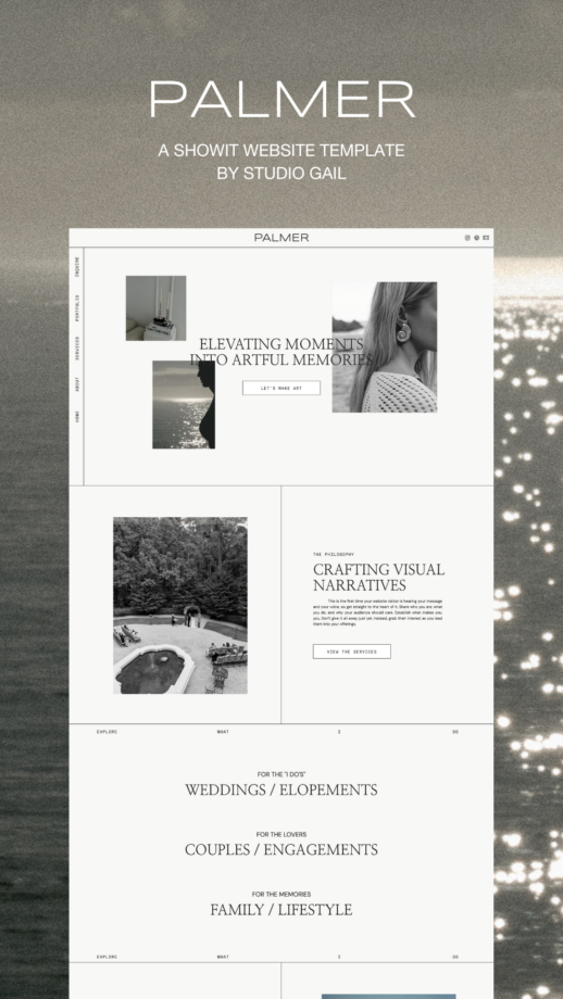
After two years of dreaming, designing, and tweaking, I can finally say it: Palmer is here.
If we were sitting across from each other, I’d probably be glowing, telling you how this editorial Showit template is everything I’ve wanted to offer since starting Studio Gail. She’s my first template baby, inspired by the wedding creatives I’ve worked with over the past five years, and she’s designed to make your website feel like you.
Palmer isn’t trying too hard. She’s effortlessly chic, a little coastal cool, and full of thoughtful details to help you show off your work and your vibe. But rather than just gush about her (though I totally could), let me walk you through what makes her special — page by page.
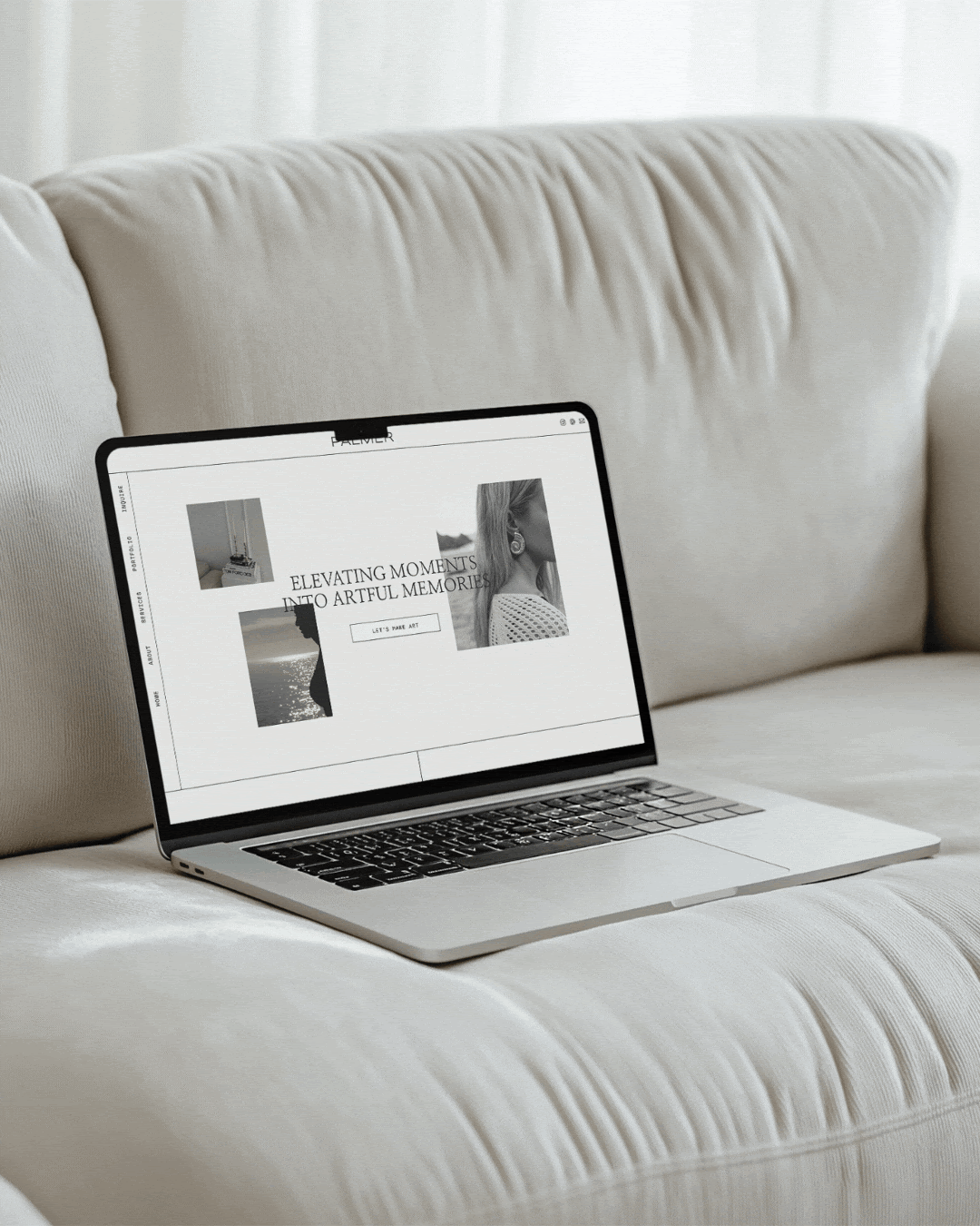
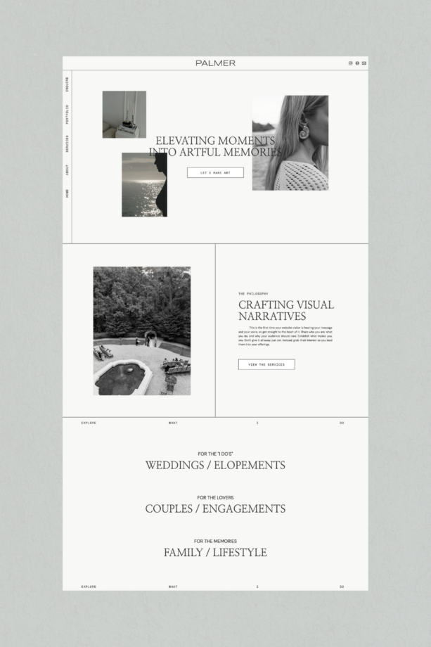
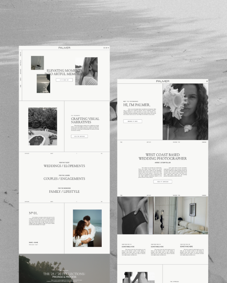
The Home Page: Where It All Begins
You know that feeling when you walk into someone’s home and it just feels like them? That’s exactly what Palmer’s home page is designed to do.
It’s simple and striking with a bold headline section to grab attention, room to showcase your best visuals, and plenty of subtle nudges that guide people deeper into your site.
It’s like the ultimate warm welcome, but without the awkward small talk.
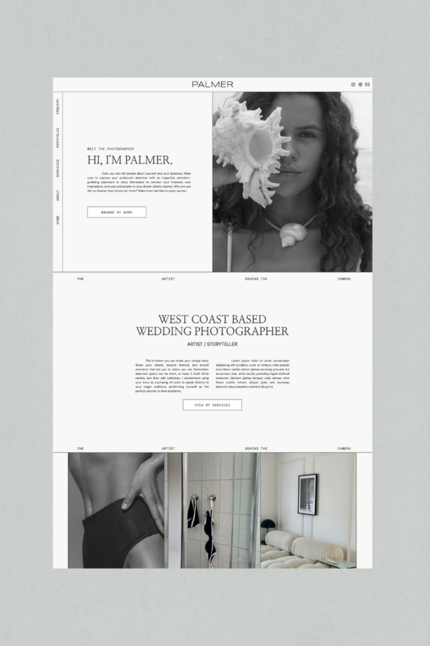
The About Page: Your Story, Front and Center
If you’re like most of the creatives I work with, this is the page that trips you up the most. How do you talk about yourself without sounding like you’re rambling?
Don’t worry — Palmer’s got you.
Her About Page is built to flow naturally, helping you share yourself in a way that feels approachable, not awkward.
There’s space for your story: what inspires you, how you work, and what makes your approach unique. Plus, there’s room for photos (because we all know people connect with faces) and thoughtful prompts to help you figure out exactly what to say.
The Services Page: Tell Them What You Do
This is where you get to show off your magic. The Services Page is clean and intentional — no over-the-top gimmicks, no overwhelm, just everything your clients need to know about working with you.
There’s room to:
- Break down your packages or offerings without overwhelming people.
- Highlight your process, so clients can see what it’s like to work with you.
- Sprinkle in your personality, because no one wants a generic sales pitch.
- Showcase your travel schedule—because if you’re ready for more destination work, your site should subtly let clients know you travel.
And let’s be real, we all know visuals seal the deal. Palmer makes it ridiculously easy to show off your work without it feeling cluttered or chaotic.
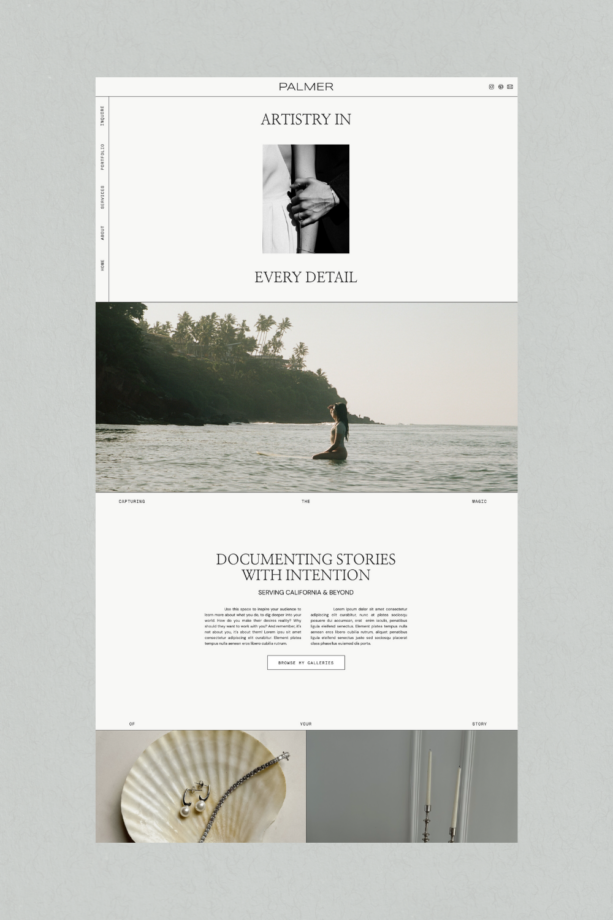
The Portfolio Page: Let the Work Speak for Itself
Your work deserves to be front and center, and Palmer’s Portfolio Page gives it the spotlight.
The layout is clean and easy to navigate, so your clients can scroll through your galleries or projects without feeling overwhelmed. Whether you want to organize by category, season, or your best work, Palmer makes it simple to curate a collection that truly reflects your style.
What it includes:
- A clean, no-fuss layout that’s built to highlight your best work.
- Clickable project galleries for people who want to dive deeper.
- Space to organize by categories, seasons, or whatever vibe fits your work best.
No fluff, no distractions — just a beautifully designed space for your creativity to shine.

The Inquiry Page: Make It Easy to Say Yes
This page is where the magic happens. Palmer’s Inquiry Page makes reaching out feel simple and stress-free.
There’s a clean, mobile-friendly form that’s easy for your clients to fill out (because no one wants to wrestle with a clunky contact form). You can also add FAQs or a note on your availability to set expectations upfront.
And when someone hits “submit,” you can leave them with a personal thank-you message — a small touch that makes a big difference.
It’s all about creating an experience that feels seamless and intentional.
Thoughtful Extras That Make Palmer Even Better
Here’s what makes Palmer more than just another website template:
- An Investment Guide Opt-In Section: Perfect for growing your email list while attracting qualified leads (without awkward third-party forms).
- No Blog Necessary: Palmer is built for creatives who don’t need a blog right now (but it’s flexible if you want to add one later).
- Mobile-Friendly Design: Because we all know your clients are scrolling on their phones.
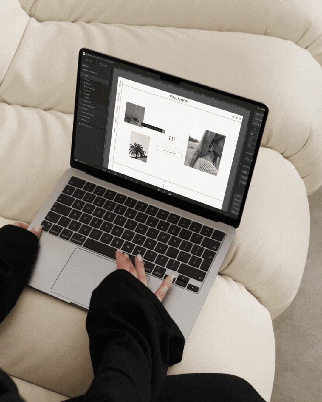
- No Code Required: You can customize everything — fonts, colors, images — with just a few clicks.
- Thoughtful Messaging Prompts – So you’re never stuck staring at a blinking cursor, wondering what to say.
She’s designed to make your life easier. Plain and simple.
Why I Built Palmer
Over the years, I’ve seen so many creatives get stuck on their websites. You’re trying to piece something together that feels polished but still you, and somehow it always ends up feeling like you’re settling.
I built Palmer to be the answer to that.
She’s everything I wish existed when I was starting out: a template that’s easy to use, looks incredible, and feels personal. She’s designed for wedding photographers, lifestyle photographers, and creative entrepreneurs who want a website that works just as hard as they do — without the stress or overwhelm.
So, Is She Yours?
If you’re ready to finally have a website that feels like home, Palmer’s here, waiting for you.
But here’s the thing: she’s limited edition. Only 10 versions of Palmer will ever be sold, which means your website stays exclusive, just like you.
Ready to meet her? Let’s do this.

Meet Palmer: Modern, Editorial Showit Website Template
Filed:


")